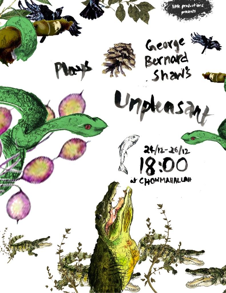
I made a pattern encapsulating the plays so, I decided to use it for all the visual identity of the Little Productions’ production of it. (This is a completely hypothetical event)

I wrote the type by hand to carry the message of stuffy. Maybe it’s because I have a very old tattered version of it but, Plays Unpleasant always seemed stuffy notwithstanding it’s exposure to unwanted, hidden emotions.
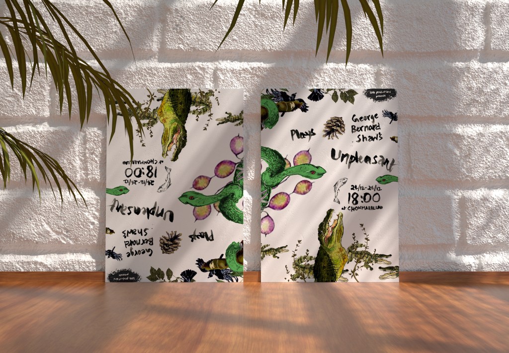
I imagine this production of the play to almost border on private viewing because it’s romantic to design a poster that might only be seen by only the few people who go to this play. Like a merchandise poster or a collectible. Like this….
